
This Colour Challenge, set by Carol Curd and Tricia Meers, was devised to get members exploring the way different colours may interact in images. They wanted us to use “the colour wheel”. Everyone was invited to submit up to three images. And these were judged – using that term extremely loosely – on 6 October. Each author was able to introduce their image and it was then critiqued by a panel of three “volunteers”.
For the challenge, Carol and Tricia were looking for “images with mainly Complementary Colours – ie, opposite colours on the colour wheel; ie, Yellow and Purple, Red and Green, Blue and Orange.”
It soon became clear, however, that not everyone had the same colour wheel in mind. And that is perhaps not surprising. There are a number of different colour wheels which have been designed for different purposes.
Much interesting discussion ensued!
The colour wheel Carol and Tricia had in mind is the most common colour wheel – the Painters, or Artists, colour wheel. It is a tool to explain what happens when coloured paints or pigments are mixed together.
This colour wheel is based on the three primary colours of red, yellow, and blue. Accordingly, it is also referred to as the RYB colour wheel.
RYB Colour Wheel

When two of the primary colours are mixed together, they produce a secondary colour (orange, green, purple aka violet). When a primary colour is mixed with a secondary colour, they produce a tertiary colour (red-orange, yellow-orange, yellow-green, blue-green, blue-violet, or red-violet).
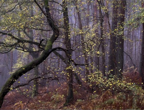
Colours which are opposite to each other on the colour wheel are known as complementary colours. There is a bold contrast when two complementary colours are placed next to each other.
Colours which are close to each other on the colour wheel are known as analogous colours. They are considered to have a harmonious relationship.
Adding white to colours produces “tints”. And adding black to colours produces “shades”. Mixing all the colours results in black, while the absence of colour results in white.
This colour model is called “subtractive” colour. And that is how we perceive the world. When we look at something – an object, a painting, or a printed photograph – we experience colour indirectly, as reflected light.
However, when we look at a screen – a TV, a monitor, or a mobile phone – we experience colour directly. The colour model for direct light is different. It is “additive” colour. Mixing all the colours results in white, while the absence of colour results in black. So “additive” colour is therefore the opposite of “subtractive” colour.
And “additive” colour uses a different colour system which is based on three primary colours of red, green, and blue (sometimes referred to as digital primaries). Accordingly, its colour wheel is referred to as the RGB colour wheel.
RGB Colour Wheel

When two of the primary colours are mixed together, they produce a secondary colour (yellow, cyan, magenta). When a primary colour is mixed with a secondary colour, they produce a tertiary colour (orange, chartreuse green, spring green, azure, violet, or rose).
Standard RGB (sRGB) is used to produce the pictures on electronic screens. And it is the standard colour space for displaying images on the internet. So, the RGB colour wheel is also used in Adobe Lightroom, Camera RAW, and Photoshop. These programmes mix different amounts of red, green, and blue light to display every colour that appears in an image on the screen. Each primary colour has its own channel which operates with values of 0 to 255. Thus, through just three digital primaries, it is possible to produce 16,777,216 colours!
- The Adobe products also have Adobe RGB – which is different from sRGB. So, check your “Color Settings”. While sRGB encompasses about a third of the visible colour range, Adobe RGB includes about a half of that range. It is therefore sometimes preferred by those printing their images.
Of course, printing requires printers and ink. And these have their own colour systems. Suffice to say, there is an awful lot of colour theory out there and it can get super-complicated very quickly. But do feel free to continue your own research.
For all that, a colour wheel is just a simple tool – a convenient way of visualising relationships between colours. And for most purposes, including the composition of photographs, the RYB (or Painters or Artists) colour wheel works just fine.
At the end of the evening, Chairman Mike Kitchingman selected his five favourite images.
- “Graffiti” by Tricia Meers
- “Newcastle” by Tim Gould
- “Bramble” by Carol Curd
- “Orange Sunset” by Tricia Meers
- “On the Beach” by Tim Gould
Congratulations to Tricia, Tim, and Carol. Great images!
For the rest of us, it was a really interesting evening with much more to it than originally met the eye.
We are all so looking forward to the next Colour Challenge.
Help Promote the Club!! Like and Share the images and post on Facebook & Flickr
For details of the competition rules CLICK HERE.
If you didn’t know, you can also post your comments at the bottom of the page. Engage with other Members and share your thoughts on the entries and judging.
Chairman’s Top Five Images


[…] https://lbpc.org.uk/2021/10/07/chairmans-challenge-colour-challenge-1/ for our own exploration of colour […]