On Wednesday 11 January, professional landscape photographer Ruth Grindrod Zoomed in from Norfolk to explain how colour, tones, and textures are all interrelated in landscape photography.
Ruth is exclusively a landscape (including seascapes and some urban) photographer and she began her talk by outlining the kit she uses. She has a Nikon D850 plus (the more lightweight) Fuji X-T3 and X-T30. She also has a range of Nikkor and Fuji prime and zoom lens, with Gitzo and Sunwayfoto tripods, plus a variety of filters.
In Ruth’s view, it is important to take the photos you enjoy taking. And she emphasised the point that you should be your own person, not a copy of others.
The aims of the presentation included showing how colour, tones, and textures interrelate, showing how they can be used out in the field, and showing how the to process them and “make your mark on a photo”. To that end, Ruth explained the nature and theory of each of these elements (ie, colour, tones, and textures) and how they are influenced by light. And she explored how the theory can be applied in practice.
Colour
Ruth showed us the Red/Yellow/Blue colour wheel and explained that the colour of an object is determined by the wavelength of the light it reflects. She also showed us a hue, saturation, and brightness cone. Hue is the colour, saturation is the intensity of the colour, brightness is how much dark or light is in the colour. So light clearly influences colour. (In passing, Ruth cautioned us against increasing saturation too much.)
The colours in the colour wheel can be combined in different ways. Ruth explained how “complementary” and “analogous” colours can be used. Most of her landscape photography concentrates on these complementary (say, blue sky or water with orangey sand) and analogous (say, orangey rocks against yellow sand) combinations.
[See https://lbpc.org.uk/2021/10/07/chairmans-challenge-colour-challenge-1/ for our own exploration of colour theory.]
Tones
In colour photography, tone is the overall lightness or darkness of an area in an image. So it concerns levels of brightness. It can also be considered in relation to its warmth or coolness. Landscapes images usually contain a wide range of colours from black through to white. Colour tonal ranges, though, can be influenced by the weather, the season, and the light. Varying the tonal range can produce different effects, as required.
Similarly, in black and white photography, images contain a range of tones which may go from pure black, through various greys, to pure white. Ansel Adams devised a Zonal System in which eleven tones were numbered from 0 (pure black) to 11 (pure white) with each zone on that scale being given an appropriate name and description – eg, zone 6, Middle Light Grey, “average white skin, light stone, shadow areas on snow”. Again, varying the tonal range can produce different effects, as required.
Tonal balance is also important – in both colour and monochrome images. This is about the contrast between light and dark areas of an image. So, the balance between the overall tone of the foreground (say, some land) and that of the background (say, the sky above the land) should be considered.
Textures
Texture is the physical feel of something. In photography it refers to the visual quality of a surface as revealed through variations in shape, tone, and colour depth.
Texture brings life and vibrancy to images that would otherwise appear flat and uninspiring. It can often be overlooked. But it can be “a real treat” that compels you to look at nature in detail. In colour photography it needs to be combined with colour and tone. However, black and white works well for tone, tonal range, and texture.
After looking at each of her three elements, Ruth returned to colour to explain the use of colour to convey emotion. Certain colours can suggest certain emotions. For example, yellow and orange may evoke feelings of warmth, happiness, or optimism. Blues and greens, on the other hand, may evoke coolness, sadness, or calmness. And, of course, colours are interrelated with tones and textures. She wondered whether this response to colour, tones and textures was emotional, artistic, or both.
She aims to get her images “right in camera”. But she also stressed the importance of post-processing skills to develop and emphasis key elements. Good processing is essential to make a picture convey your intended emotion or “mood”. Ruth encouraged everyone to strive to convey emotion in their work.
Accordingly, it is helpful to process with an aim in mind. The style and approach used can then be adjusted as required to achieve the result being sought.
Ruth processes her RAW images with a view to producing prints. She showed us a videoed demo of herself processing an image (on Adobe Camera Raw) to change the mood of the image. The processing was not particularly complicated but significantly enhanced the image. It consisted just of some global adjustments to Temperature and Basics followed by some local adjustments to Basics, some adjustments in Color Mixer, and the addition of a simple vignette.
In summary, Ruth’s key points were as follows.
- Colour, tones, and textures are integral to landscape photography;
- Colour, tones, and textures interrelate;
- You need to understand how they all work together;
- You should strive to convey emotion; and
- Good processing is an essential skill, especially if you print your images.
Ruth finished her presentation with a lovely slideshow – a medley of her wonderful landscape images accompanied by beautiful music.
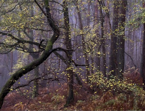
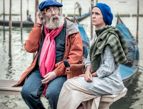
This expert presentation should give everyone a better understanding of how to make the best use of colour, tones, and textures in our own landscape photography. And it was lavishly illustrated with plenty of Ruth’s own well observed and artistic images from around the UK (eg, Norfolk, Yorkshire, Scotland, Northumberland) and beyond (eg Iceland, Venice). Her work is diverse in style and approach and ranges from the subtly atmospheric to the colourfully dramatic. All very enjoyable.
More of Ruth’s work can be found on her website https://www.ruthgrindrodlandscapephotography.co.uk/
She is also on Twitter, Facebook, and Instagram. And she has a YouTube Webinar “A Guide to Processing Images with Ruth Grindrod” (2020) https://www.youtube.com/watch?v=_M9UJQpe6F4


Leave a Reply