On Wednesday 16 December Jonathan Vaines LRPS CPAGB AFAIP Zoomed into LBPC to deliver his presentation “Compose Yourself”.
He is also President of the Cambridge Camera Club and a regional organiser for the RPS.
His introduction to photographic composition explained both the basics of photographic composition and some more complex ways of structuring photographs.
Photographic composition is simply the way all the individual elements combine to form the final image. It therefore, brings order to what might otherwise be chaos. However, it can be more difficult for a photographer than, say, a painter who has total control over what is included in a painting. Looking through the viewfinder and attempting to put everything the photographer wants in the image into the right place can be quite problematic. Accordingly, it is considered by some people to be something of a “dark art”.
Jonathan started with the Rule of Thirds and the Golden Ratio where key elements of an image are positioned on the intersections of horizontal and vertical lines. He explained what the Rule of Thirds and the Golden Ratio are, how they work, how they relate to each other, and how they can be used to compose pictures.
He also covered the Golden Spiral and the Fibonacci Spiral, in particular how they can be found everywhere in nature (eg, in the structure of a nautilus shell) and have been copied in man-made endeavours such as architecture.
Jonathan has taught himself to look through the viewfinder and imagine, for example, the Golden Ratio. This sort of visualisation takes practice. But it enables him to really consider compositional options at the picture-taking stage. These options might also include what he described as a “triangle crop” or a “diamond crop”, where key elements of the image are positioned on the intersections of diagonal lines.
Moving on from these rules, Jonathan covered a number of other matters that might usefully be considered in the making of an image.
Height and depth – To create a 2D image from a 3D world you need to create height and depth in the image. Putting the lens low down and pointing upwards creates height. Putting things close to the lens creates a strong foreground and similarly creates depth.
Isolation – Isolating a small object from a large environment concentrates interest.
Balance – This refers to how the elements of an image relate to each other within the composition in terms of their “visual weight” and the aim is to create visual equilibrium. So, the photographer might consider the left of the image compared with the right, the foreground compared with background, and corners compared with opposite (diagonally) corners.
Lead-in lines – Our eyes unconsciously follow lines in images. By placing lines within images, the viewer’s eye can be drawn through the scene and directed to the focal point. However, make sure if you lead the eye in, you don’t lead it out again.
Subject and place connection – It makes sense to photograph something where it should be (eg, a boat in water). But doing it differently, particularly with humour, can also make a strong image.
Numbers – In general, images are more visually appealing when there is an odd number of subjects. (The number must be obvious; more than nine and no one notices.) However, even numbers also work – eg, a pair.
Colour Wheel – This circular diagram of colours that can be used to match up colours according to the result required. Complementary colours are arranged opposite each other (eg, red is opposite green) and the use of two complementary colours in an image creates maximum contrast. Correspondingly, the use of colours next to each other in the Colour Wheel minimises contrast.
Restricted colours – Paring back (ie, lightening) colours in an image can emphasise the composition.
Frames – This is about the use of elements of a scene to create a frame within the image to highlight the subject. You can frame the subject with, say, a doorway or an arch. You might also frame with colour.
Patterns – Patterns are attractive to the eye. Breaking a pattern can create a focal point of interest and draw attention to the pattern. Symmetry can also work, whether horizontal, vertical, or central (radial). With true symmetry, all parts on one side of the line of symmetry will exactly mirror all parts on the other side. But partial symmetry, where something is included on one side only, can draw attention to the symmetry – just as breaking any other pattern. Flipping an image, whether horizontally or vertically, while retaining the original, creates symmetry. And flipping an image both horizontally and vertically creates “Kaleidoscope” images.
Shallow depth of field – Focusing on the point of most interest, while keeping the rest of the image out of focus, concentrates attention where you want it.
Square crop – A square may be hard to visualise in a rectangular viewfinder. But it screams “arty”. A square crop also suits other shapes, such as bold circles and bold triangles. And it is also good for architecture.
Monochrome – This works well for strong shapes, especially architecture, as it strips matters back to shape and form by removing the distractions of any colours.
Colour negative – Images can be “inverted” in Photoshop to create interesting effects.
Wide-angle – A wide-angle lens produces an image that is different from the natural view of an eye. You need to get close to the subject, get it straight in the frame and accept that other effects (such as barrel distortion) will occur.
Textures and Layers – Adding textures to an image in post-processing, especially adding multiple textures in layers, adds richness and depth.
Multiple Images – It is always worth taking a variety of different images of a subject to explore a range of creative possibilities. (It is also worth trying multiple exposures – in-camera, if your camera permits it, or by layering different shots in post-processing.)
Ultimately, careful composition is the difference between a picture taken by someone with a camera and an image made by a photographer.
Jonathan is an articulate and fluent speaker and this was an interesting and entertaining presentation. He adroitly explained the mechanics of all these various aspects of photographic composition and then demystified their application.
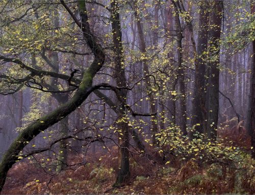
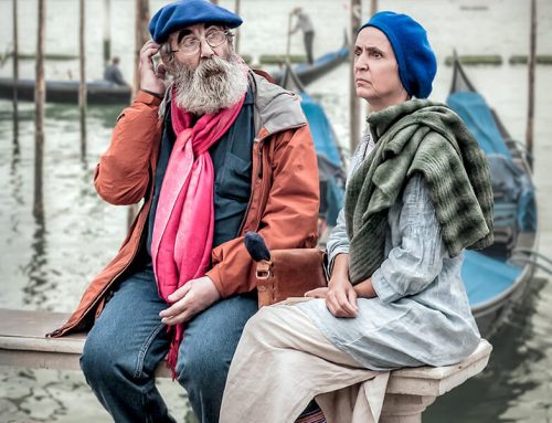
And it was all beautifully illustrated with images taken by himself and his wife (Sue Vaines LRPS CPAGB). The range of these spanned successful club images through to International medal and award winners.
Accordingly, there was much to learn in this presentation – and just as much to admire.
")
")

")

If you missed this talk you can watch the recording, available in the Members Only section of the website.
Remember to support the Club by Liking and Sharing this article on the Clubs Public Facebook page:
Leighton Buzzard Photographic Club | Facebook


Leave a Reply